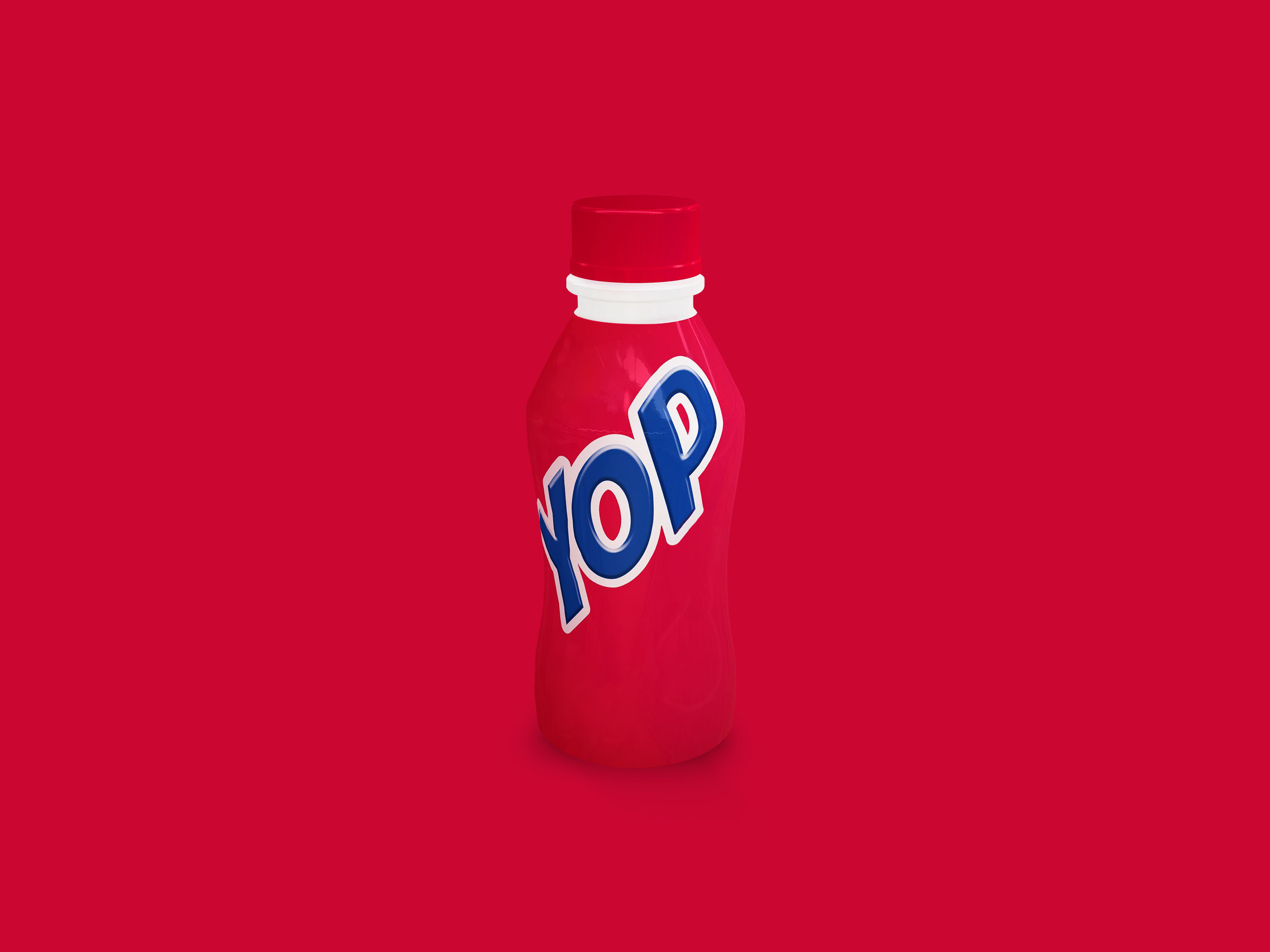
Packaging design concept for Yop yogurt explores a minimalist approach for CPG retail and trade marketing environments. The bottle layout utilizes bold color blocking and clean typography to ensure immediate brand recognition and clear flavor communication on crowded shelves. By stripping away excess visual noise, the design focuses attention on the essential product information making it highly effective for quick scanning by consumers in busy retail settings or attendees at trade shows. The scalable visual identity is built to maintain consistency across various physical touchpoints including in-store displays, event activations, and promotional sampling stations.
SEE our work
Browse 3000+ CPG design examples across packaging, retail, social, print & more.


Join 400+ CPG brands who keep their design moving with a dedicated team — without hiring full-time