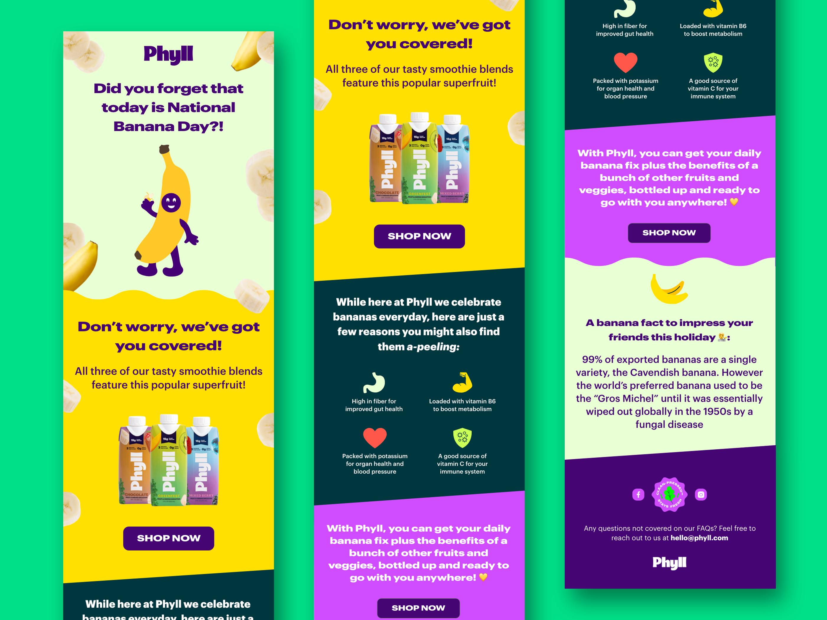
Email newsletter design series for a CPG smoothie brand demonstrates how color and layout effectively differentiate product variations while maintaining brand consistency across digital channels. Each design uses a distinct color palette tailored to specific flavors like Berry Blast Tropical Paradise and Green Machine to create immediate visual recognition and appetite appeal. Clean hierarchy guides subscribers from vibrant hero imagery through engaging content sections such as recipes ingredient spotlights and community challenges down to clear calls to action. Templates designed for performance in e-commerce and lifecycle marketing campaigns balance promotional messaging with valuable content to drive engagement and repeat purchases in the competitive beverage market.
SEE our work
Browse 3000+ CPG design examples across packaging, retail, social, print & more.


Join 400+ CPG brands who keep their design moving with a dedicated team — without hiring full-time