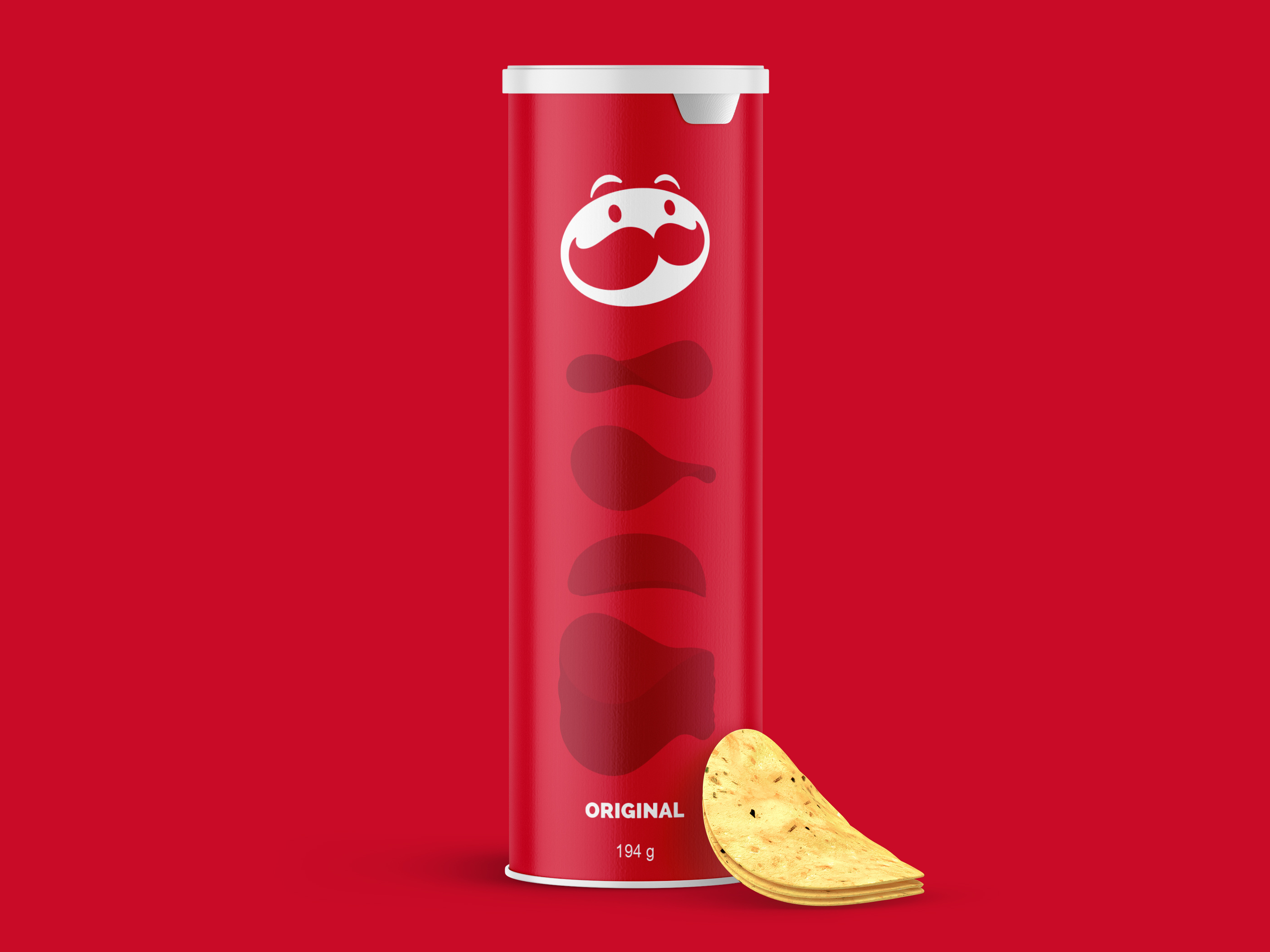
CPG packaging design concept for Pringles created to explore minimalist branding strategies for trade shows, industry events, and retail innovation showcases. The stripped-back layout intentionally removes traditional brand assets like the mascot to focus entirely on flavor identification through bold, saturated color blocking and clean, oversized typography. Reductive approach ensures immediate visual impact and clear communication of variety from a distance in busy experiential environments. Designed as a conceptual mockup for strategic presentations, the packaging demonstrates how established snack brands can modernize their visual identity to cut through clutter and engage audiences in specific marketing channels outside traditional grocery aisles.
SEE our work
Browse 3000+ CPG design examples across packaging, retail, social, print & more.


Join 400+ CPG brands who keep their design moving with a dedicated team — without hiring full-time