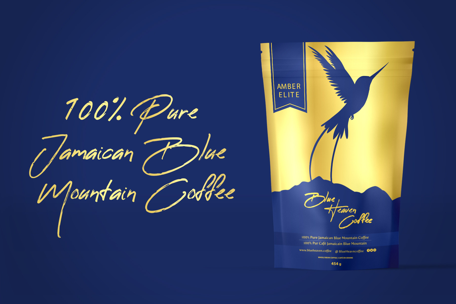
CPG packaging design for a coffee brand establishes a strong visual identity on retail shelves and at trade show events. The stand-up pouch format utilizes a clear color-coding system to differentiate between House Blend Espresso Roast and Single Origin varieties, making it easy for consumers to identify their preferred roast profile quickly. Bold typography ensures key product information is legible from a distance while distinct illustrative graphics add character and reinforce the specific brewing method or origin story for each SKU. Designed for scalability and shelf impact, this packaging system balances individual product distinction with cohesive brand recognition to support impulse purchases and brand trial in competitive CPG environments.
SEE our work
Browse 3000+ CPG design examples across packaging, retail, social, print & more.


Join 400+ CPG brands who keep their design moving with a dedicated team — without hiring full-time