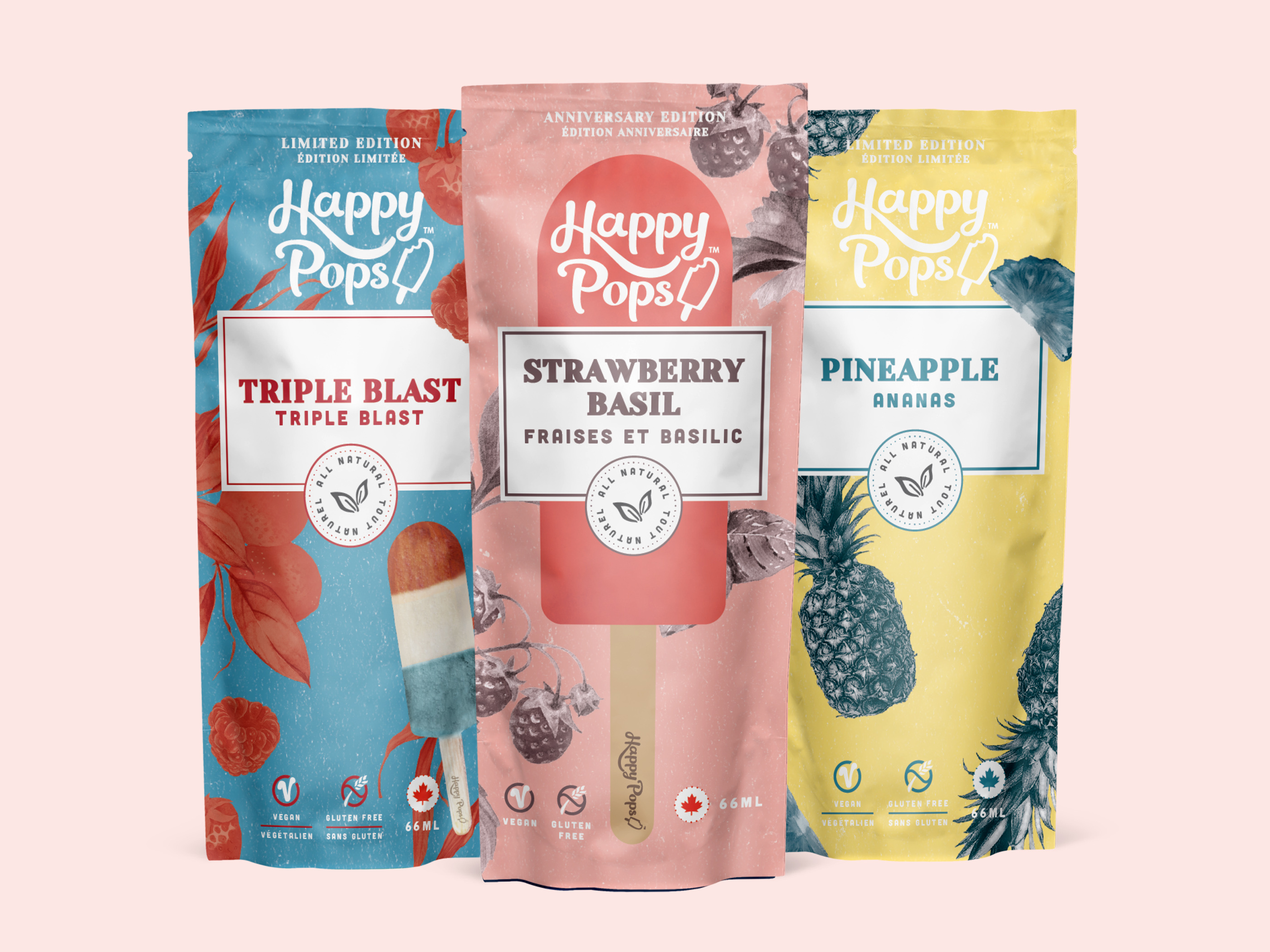
Retail packaging design for ice pops delivers strong shelf presence and brand recognition for CPG snack brands in competitive retail environments and busy event settings. The vibrant retro-inspired aesthetic uses bold typography and playful fruit illustrations to communicate flavor variety and summery appeal instantly to consumers. High-contrast color blocking ensures the package stands out on crowded freezer shelves while clear messaging highlights the product type effectively. Designed for versatility across trade shows, sampling activations, and in-store promotions, the packaging execution balances visual impact with clear communication to drive trial and impulse purchases.
SEE our work
Browse 3000+ CPG design examples across packaging, retail, social, print & more.


Join 400+ CPG brands who keep their design moving with a dedicated team — without hiring full-time