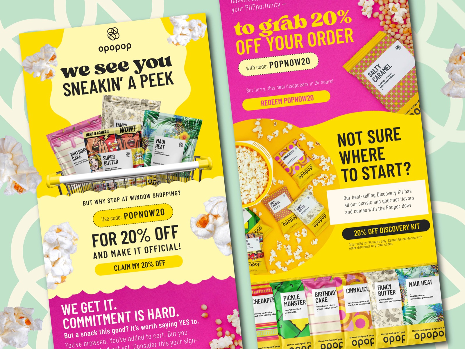
Email design for Opopop engages customers through cart abandonment recovery and product discovery campaigns. Vibrant color palette of yellow and pink creates a fun and energetic tone that aligns with the snack brand's identity. Clear typographic hierarchy and prominent calls to action guide the user towards redeeming offers and exploring the product range. Product forward imagery, including the Discovery Kit and individual flavor packs, is strategically placed to entice clicks and drive conversion. Designed for mobile and desktop performance, emails balance brand storytelling with direct response elements to support e-commerce growth.
SEE our work
Browse 3000+ CPG design examples across packaging, retail, social, print & more.


Join 400+ CPG brands who keep their design moving with a dedicated team — without hiring full-time