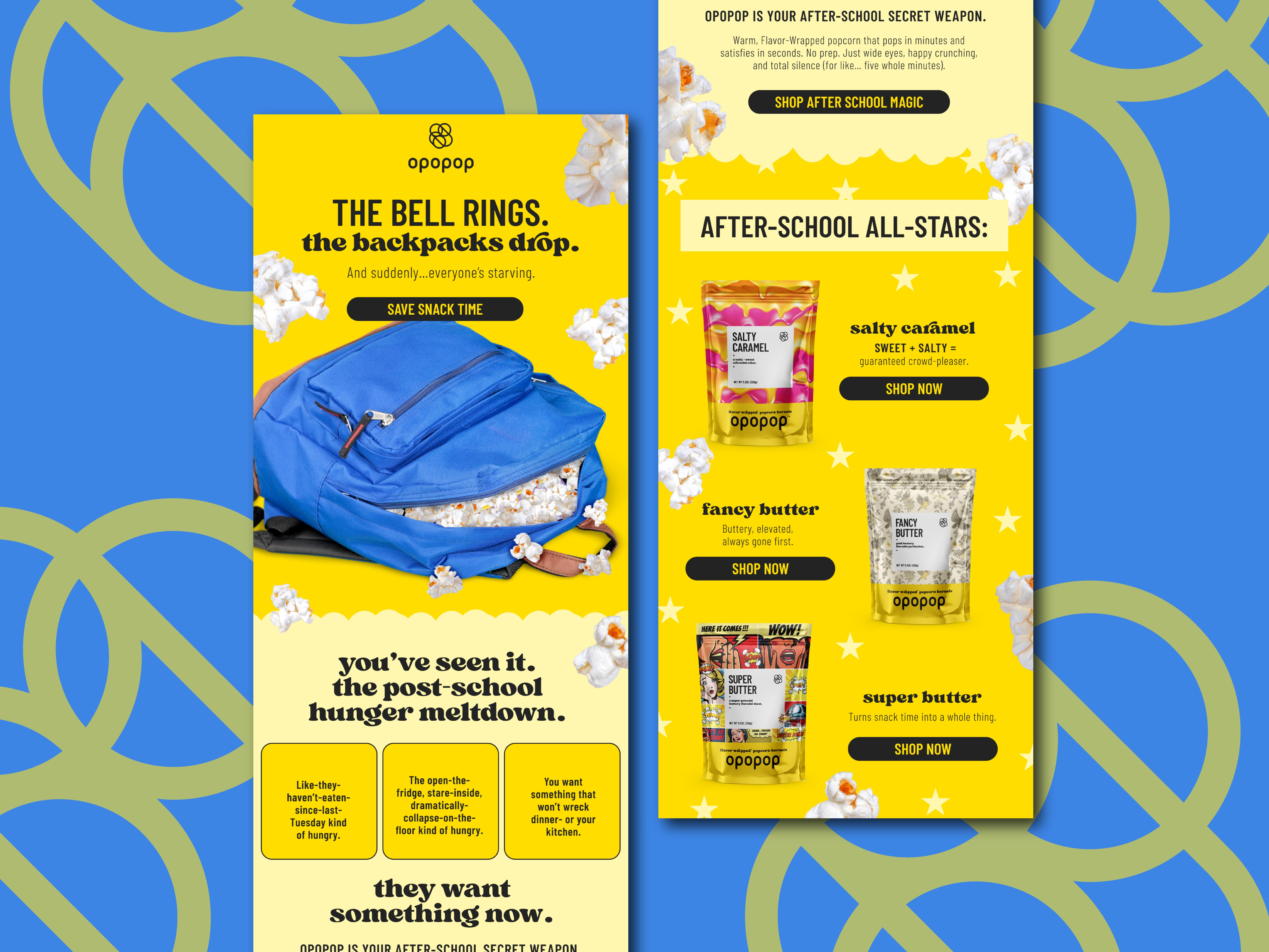
Email marketing design for DTC popcorn brand Opopop captures attention during the back to school season and drives e-commerce sales. The layout uses a vibrant yellow and blue color palette with playful typography to create immediate brand recognition and excitement around after school snacking. A clear visual hierarchy guides the reader from the main hook and hero image down to specific product offerings like Salty Caramel and Fancy Butter. Bold calls to action are strategically placed to encourage click throughs while product forward imagery reinforces appetite appeal. Designed for performance in promotional campaigns, this creative balances brand storytelling with a conversion focused structure to support direct to consumer growth and customer engagement across digital channels.
SEE our work
Browse 3000+ CPG design examples across packaging, retail, social, print & more.


Join 400+ CPG brands who keep their design moving with a dedicated team — without hiring full-time