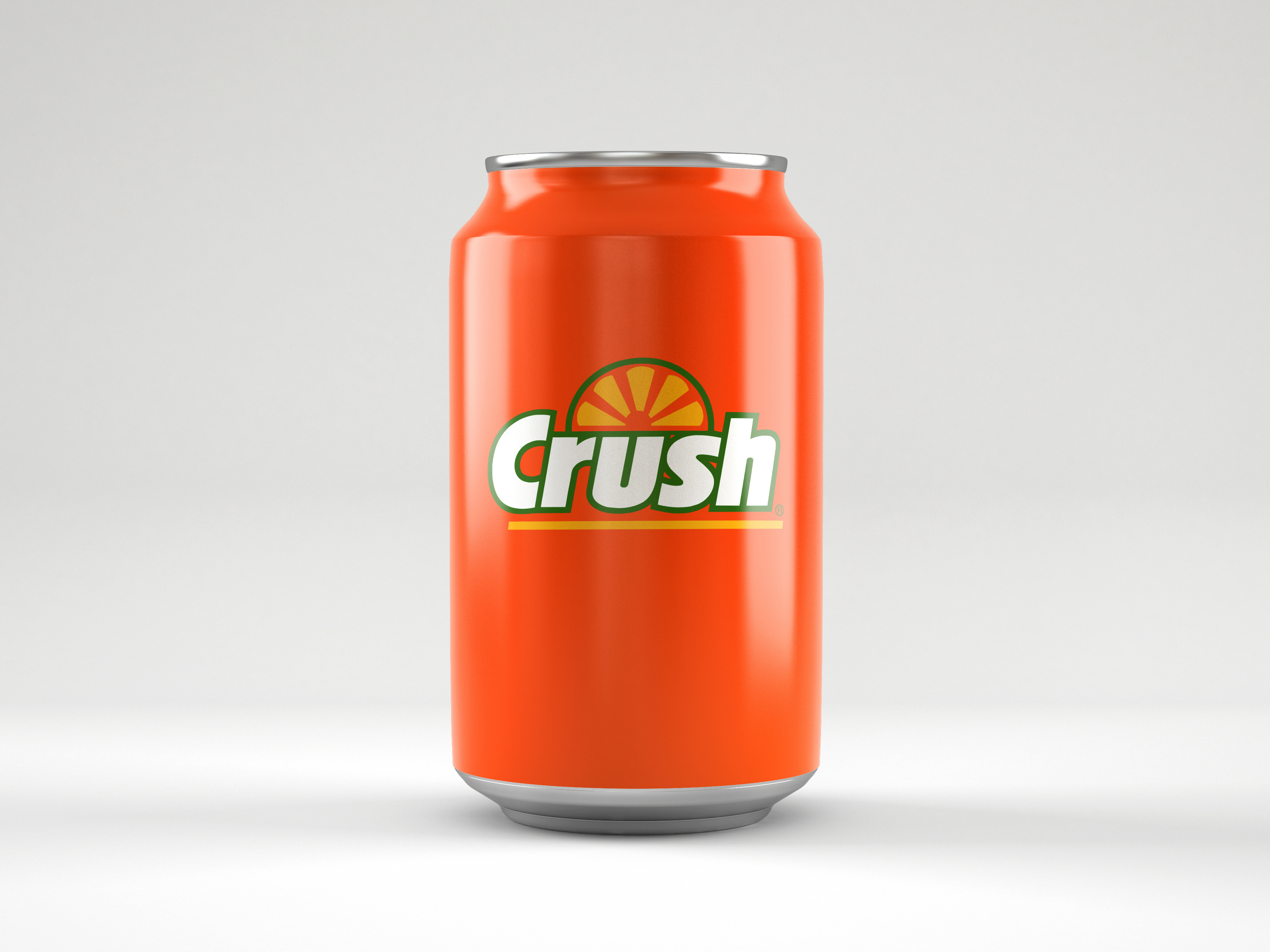
Minimalist packaging design concept for Crush soda explores how a reductive visual approach can enhance brand presence in busy retail and event environments. By stripping away complex graphics and focusing on bold matte color blocking paired with stylized glossy fruit icons the design achieves instant flavor recognition from a distance. Clean sans serif typography modernizes the brand image while ensuring maximum readability on shelf or at trade show beverage stations. The concept demonstrates how simplified CPG branding creates a premium feel and cuts through visual clutter to attract consumer attention during promotions and experiential activations.
SEE our work
Browse 3000+ CPG design examples across packaging, retail, social, print & more.


Join 400+ CPG brands who keep their design moving with a dedicated team — without hiring full-time