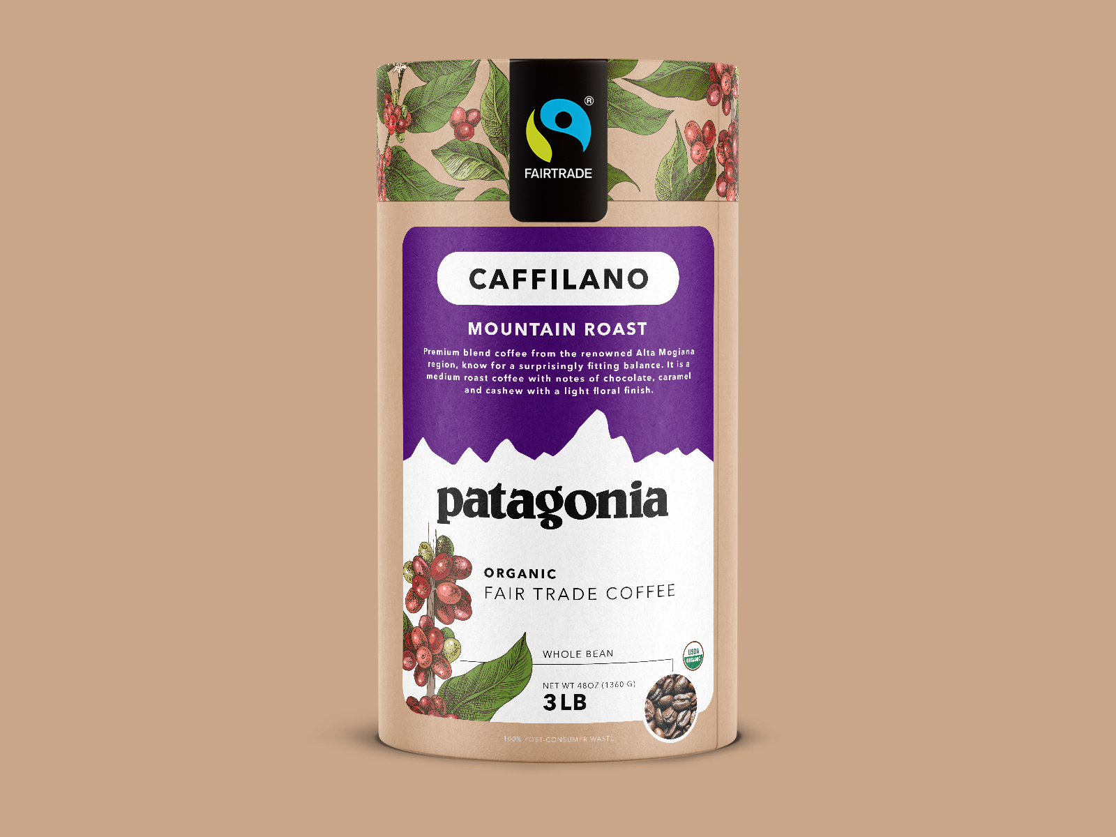
Coffee packaging design and branding for Wake Up Club establishes a distinct visual identity on crowded retail shelves and at industry events. Flexible pouch layouts utilize a nostalgic retro aesthetic with bold typography and vibrant color blocking to differentiate between Morning Blend Daily Grind and Night Owl roast varieties. Clear visual hierarchy prioritizes brand name and flavor profiles while secondary details like roast level and net weight remain easily digestible for quick consumer decision making. Cohesive system ensures strong brand recognition across different SKUs and provides high visibility for trade show displays and in-store retail promotions.
SEE our work
Browse 3000+ CPG design examples across packaging, retail, social, print & more.


Join 400+ CPG brands who keep their design moving with a dedicated team — without hiring full-time