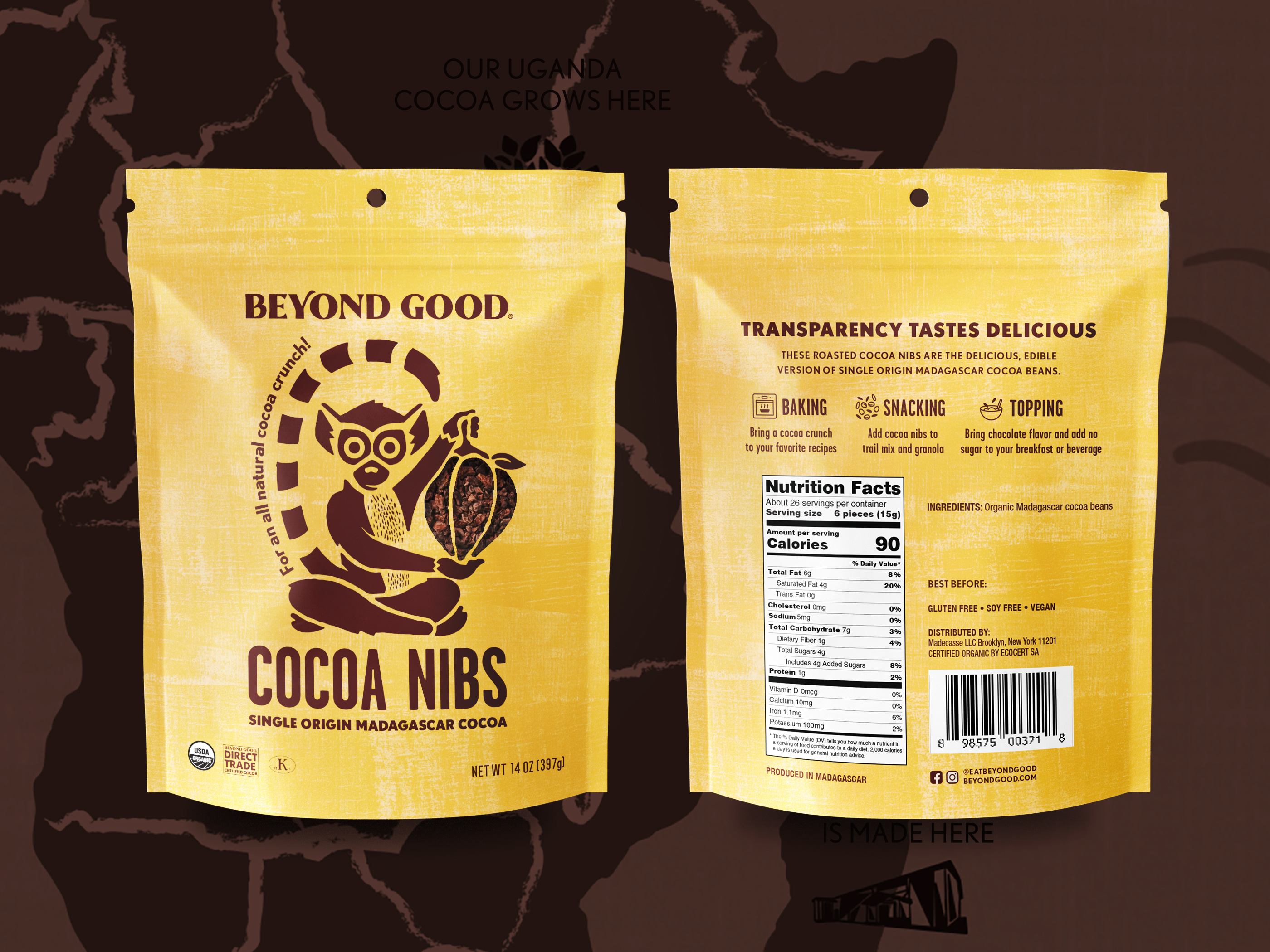
Retail packaging design for TCHO Cocoa Nibs delivers strong shelf impact and clear product communication across busy retail environments and trade show displays. Its stand-up pouch format utilizes a distinct color coding system to differentiate between flavors like Sweet & Salty and Original allowing consumers to navigate the product range quickly. Bold typography and clean hierarchy ensure the brand name and product descriptor are readable from a distance while botanical illustrations add a layer of natural appeal. Designed for versatility in both mass retail and experiential marketing settings this packaging balances premium aesthetics with functional clarity to drive trial and brand recognition.
SEE our work
Browse 3000+ CPG design examples across packaging, retail, social, print & more.


Join 400+ CPG brands who keep their design moving with a dedicated team — without hiring full-time