.webp)
.png)
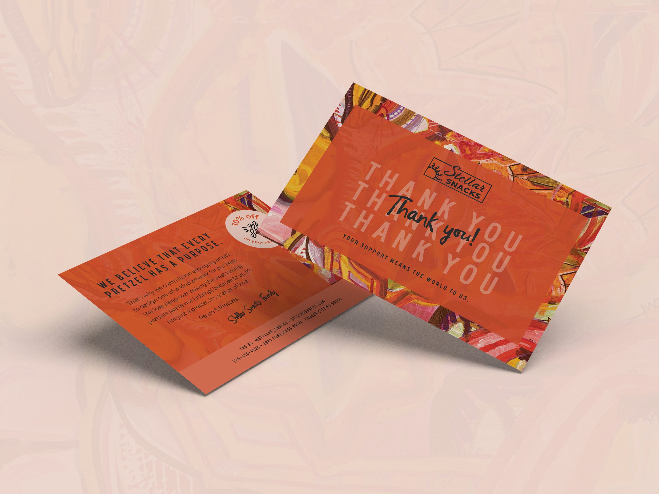
Postcard design and print collateral supports CPG snack brand Pretel's post-event engagement and retail promotions. The double-sided layout utilizes high-contrast color blocking with a dark blue front featuring bold typography and ingredient illustrations to maximize brand recognition. The reverse side provides a clean hierarchy for messaging, directing recipients to the website and social media channels while offering an incentive to drive trial and conversion. Serving as a tangible touchpoint for distribution at trade shows, sampling events, and as unboxing inserts, it reinforces brand identity and encourages continued customer interaction beyond the initial point of contact.
Browse 100+ CPG design examples across packaging, retail, social, print & more.

Every example in this library was designed by DarkRoast's team.


.webp)
.webp)