.webp)
.png)
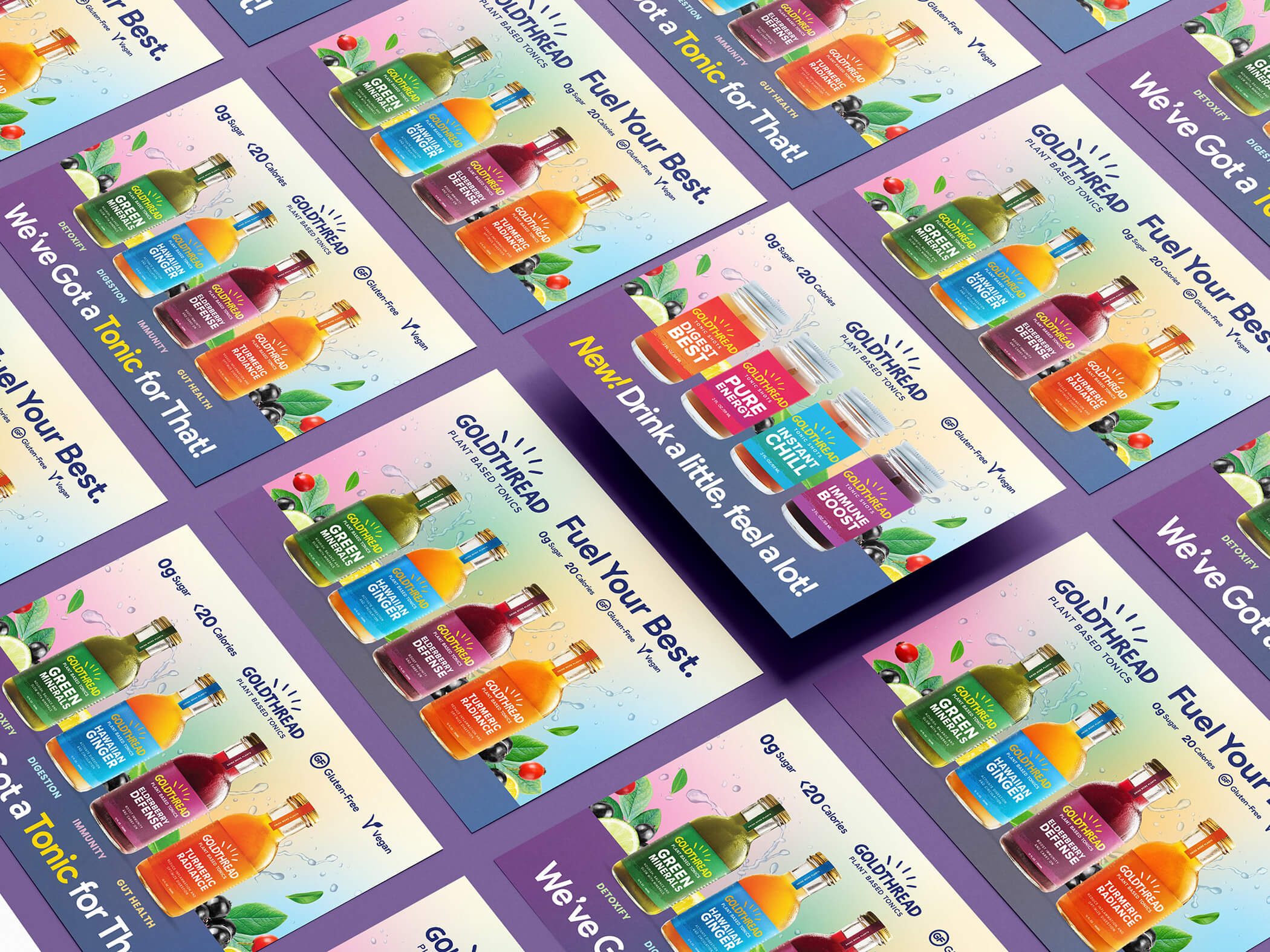
Postcard designs for a plant-based tonic drink brand serve as versatile trade marketing collateral for events, trade shows, and retail promotions. The set features three distinct color palettes corresponding to different flavor profiles, using clean illustrations of bottles and fresh ingredients to communicate natural quality instantly. Clear typography highlights key selling propositions like healthy, natural, and organic to ensure the message is easily digestible for busy attendees or shoppers. Designed as tangible takeaways, printed cards serve to reinforce brand recognition, support product sampling initiatives, and provide potential customers with a physical reminder of the product benefits long after initial contact. The cohesive visual identity across the series ensures consistent brand presentation in various physical marketing environments.
Browse 100+ CPG design examples across packaging, retail, social, print & more.

Every example in this library was designed by DarkRoast's team.


.webp)
.webp)