.webp)
.png)

Business card design and brand identity collateral for Pipers Crisp Co supports networking at trade shows, industry events, and retail promotions. The design utilizes vibrant color blocking in distinct pink and blue hues to ensure immediate visual impact and brand recall in busy professional environments. A clean typographic hierarchy prioritizes key contact information while the prominent logo and stylized potato plant illustration reinforce the brand's premium positioning and tagline. Designed as a tangible touchpoint for buyers and partners, these double-sided print assets deliver a professional and memorable brand experience that extends beyond the initial meeting.
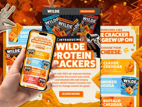
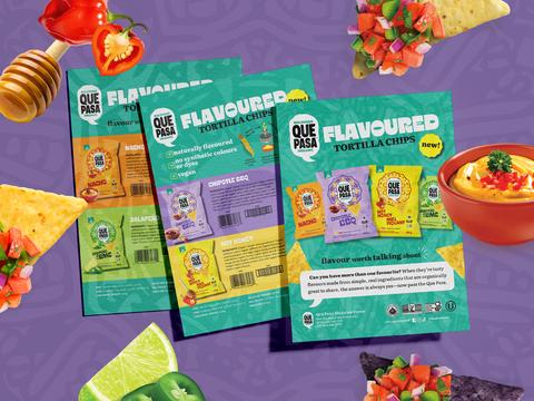
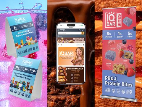
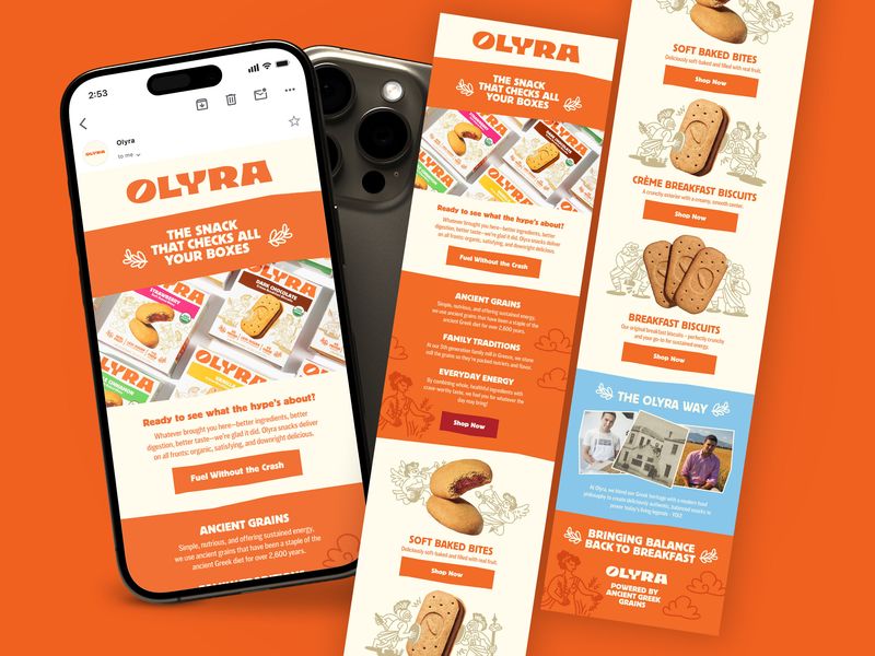
Browse 100+ CPG design examples across packaging, retail, social, print & more.

Every example in this library was designed by DarkRoast's team.


.webp)
.webp)