.webp)
.png)
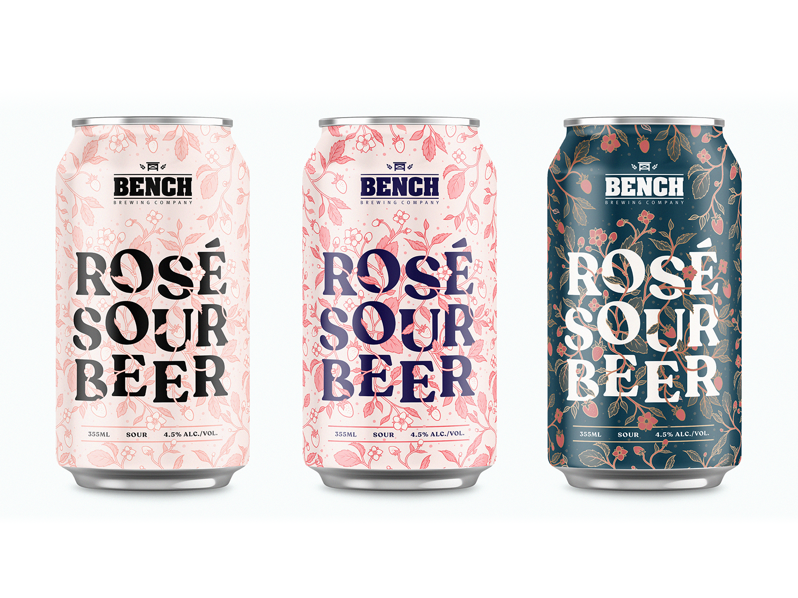
Packaging design and illustration for Oddity Brewing delivers strong shelf impact and brand recognition in competitive retail environments. The three distinct can designs utilize vibrant abstract illustrations and bold color palettes to differentiate flavors while maintaining a cohesive brand family feel. Clear typography for the brand name and key messaging ensures readability at a distance which is crucial for capturing attention in busy aisles or crowded trade show settings. The playful yet premium aesthetic is designed to engage consumers and encourage trial across various touchpoints including in-store promotions and experiential events. CPG packaging execution balances artistic flair with commercial clarity to support brand growth and market penetration.
Browse 100+ CPG design examples across packaging, retail, social, print & more.

Every example in this library was designed by DarkRoast's team.


.webp)
.webp)