.webp)
.png)
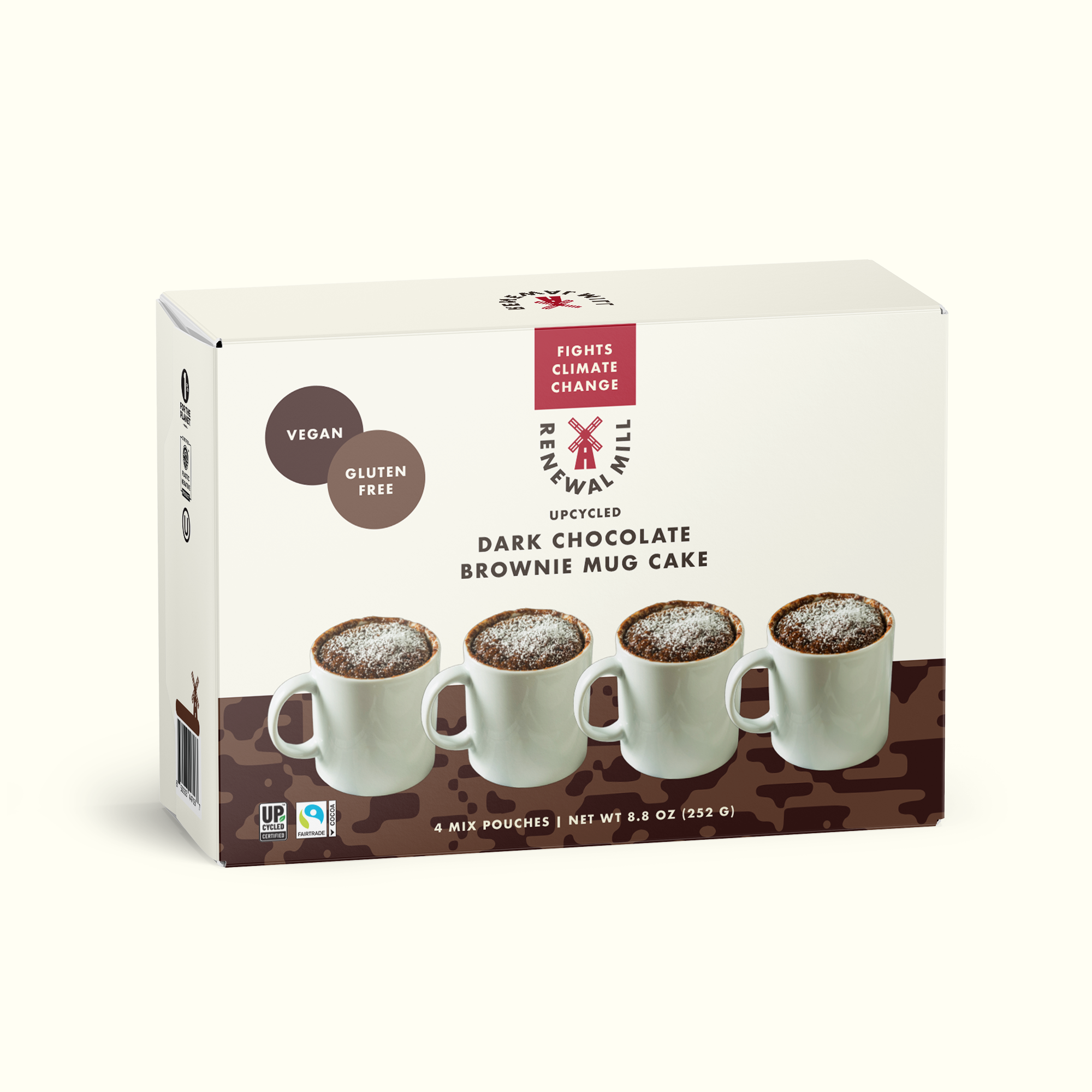
Retail counter display design for Brownie Mug drives impulse purchases and brand recognition in busy retail environments and trade show settings. The compact point-of-purchase unit uses a warm color palette and appetizing product photography to immediately communicate flavor and comfort. Clear typographic hierarchy emphasizes the core value proposition of a warm fudgy treat ready in a minute making it easy for consumers to understand the concept quickly. Designed to hold multiple individual units while maintaining a small footprint this packaging solution balances structural integrity with impactful branding to support new product launches and promotional activations across various channels.
Browse 100+ CPG design examples across packaging, retail, social, print & more.

Every example in this library was designed by DarkRoast's team.


.webp)
.webp)