.webp)
.png)
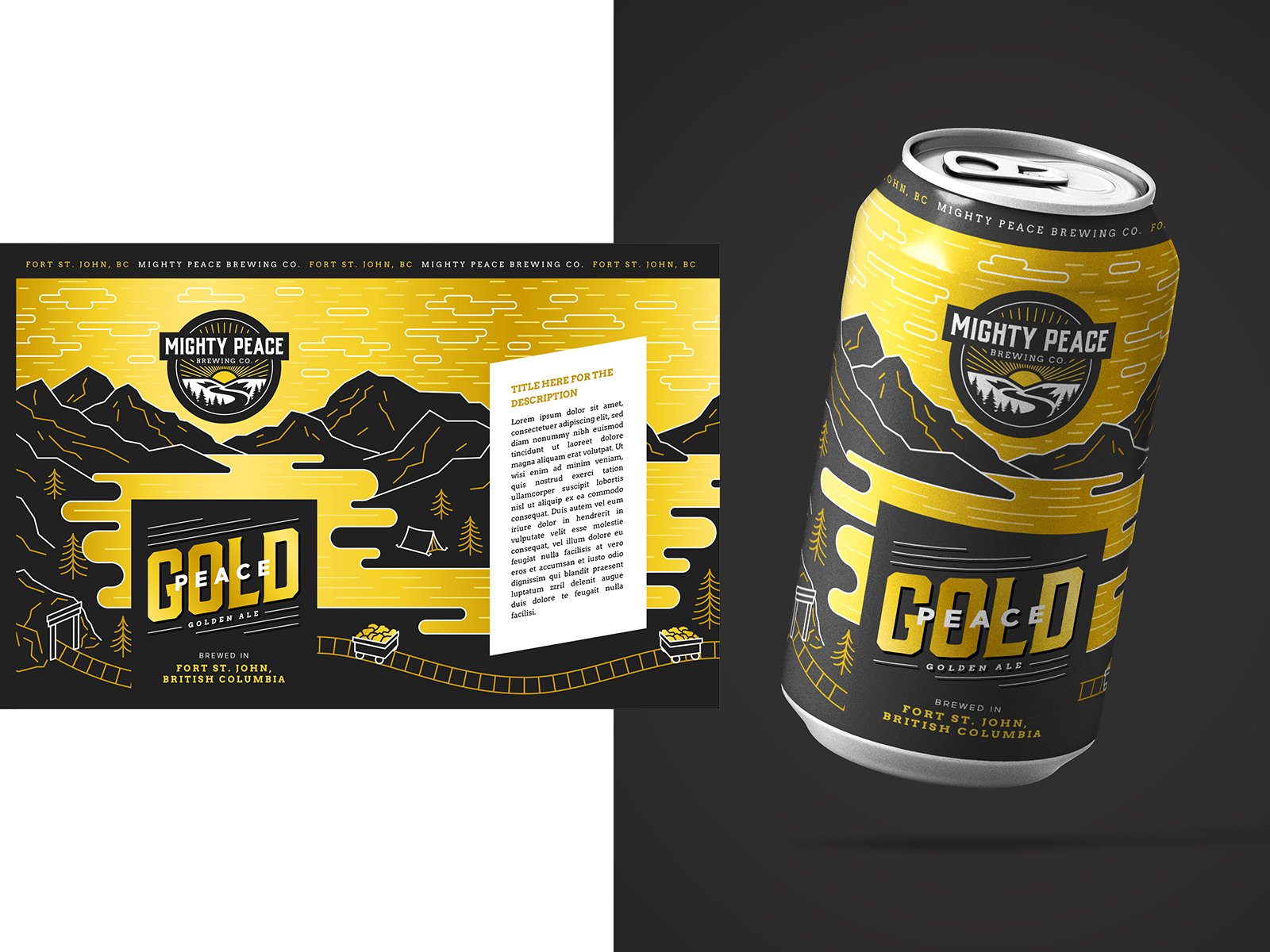
Beverage can design series delivers strong shelf impact and brand storytelling for a craft brewery product line. The packaging uses cohesive illustration and bold color palettes to differentiate distinct flavors while maintaining unified brand recognition across the sequence. Outdoor adventure themes like hiking and rafting are rendered in a clean graphic style to connect with target audiences in retail environments and experiential settings. Clear typography ensures product names are easily readable at a glance supporting quick decision making in busy aisles. Designed for versatility, this packaging system performs effectively in standard retail displays as well as promotional events and trade show activations.
Browse 100+ CPG design examples across packaging, retail, social, print & more.

Every example in this library was designed by DarkRoast's team.


.webp)
.webp)