.webp)
.png)
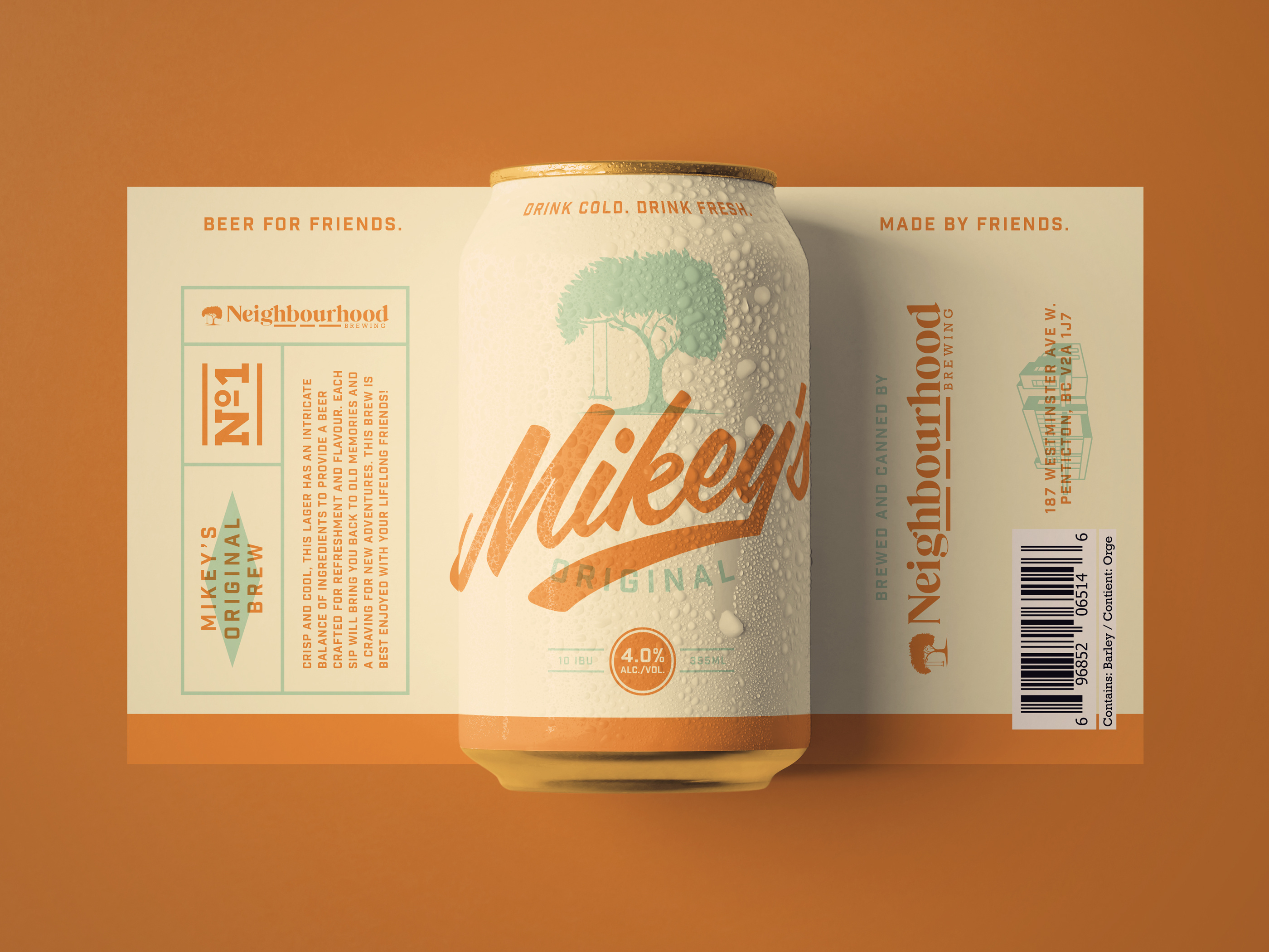
Packaging design for Neighbourhood Brewing's Mikey's Original Brew establishes a friendly and approachable brand identity on retail shelves and at craft beverage events. The vintage inspired label art uses a warm orange and cream color palette with retro typography to convey a sense of tradition and community, reinforcing the "Beer for friends" tagline. The layout balances clear brand messaging with essential product details, ensuring the can stands out in competitive CPG environments while remaining easy for consumers to navigate. Presented as both a 3D can mockup and a flat label view, the design demonstrates how cohesive branding and thoughtful illustration can drive product trial and build lasting connections in the craft beer market.
Browse 100+ CPG design examples across packaging, retail, social, print & more.

Every example in this library was designed by DarkRoast's team.


.webp)
.webp)